

Positioning a healthcare consultancy for growth
Freed Associates is a team of experienced consultants that specialize in healthcare management, operations, and IT services for hospitals and providers across California. Freed emphasizes a healthy work-life balance for their consultants and is consistently voted one of the best places to work in the Bay Area.
After more than 20 years in business, Freed Associates hired Manmade to rebrand the consultancy and support their expansion into new services and territories. We helped Freed define their brand, developed a new corporate identity system, and redesigned their website.
Services
- Competitive Analysis
- Brand Strategy
- Content Strategy
- Information Architecture
- Identity Design
- Web Design
Communicating the value
Before beginning the visual design process, we needed to be able to verbally articulate what makes Freed Associates unique. We worked with their leadership team and consultants to clarify and define Freed’s essential value proposition. Through interviews, content audits, and brainstorming exercises, we cataloged the many characteristics of Freed and the way they work. By the end of this process, we had distilled these down to a core set of 5 brand attributes: dedicated, empathic, expert, principled, and skilled navigator.


Defining the essence
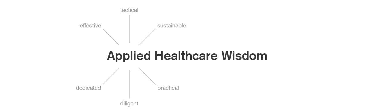
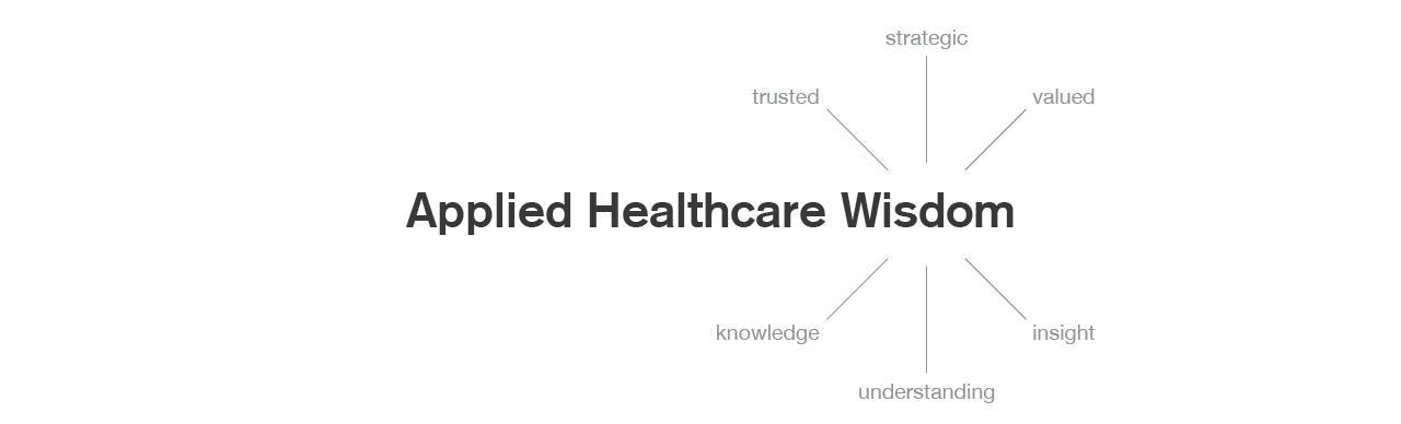
We defined the essential promise of Freed Associates as “Applied Healthcare Wisdom”. Freed consultants not only have the specialized healthcare knowledge their clients seek, they also have the skills and experience to implement that knowledge efficiently and effectively.

Visualizing wisdom
To design the logo, we researched and explored forms that would evoke the brand attributes and essence. The attributes principled, skilled, and expert conjured images of craftsmen and the maker’s mark. The idea of wisdom is conveyed across cultures through the use of symmetrical, circular forms. Our combination of these concepts led to the creation of the Freed seal—a mark of experience and quality.


Finding the right type
Selecting the perfect typeface is a key part of the identity design process. For Freed, we narrowed the search to Rooney Pro, a serif face with a modern feel. Soft, rounded terminals make the typeface approachable without compromising its gravitas. The font’s designer, Jan Fromm, fine-tuned the type and worked with us to create a custom wordmark.


Setting the tone
Blue and orange were already being used by Freed for their website and collateral. Our research found that this palette was both differentiated from competitors and also appropriate for the new brand definition—orange is the color of wisdom and illumination, and blue evokes trust. We updated and modernized the color palette with a richer blue, a brighter orange, and a suite of secondary colors.


Building the online presence
One of the first applications of the new Freed Associates identity is their website. Built on a customized WordPress backend, the site features case studies, white papers, articles, and commentary that help to establish Freed as a thought leader within the healthcare consulting industry.


Freed Associates